An Inside Look at Logo Design
Designing a good logo is the toughest and most rewarding challenge a designer faces. When you get it right, the logo looks like it’s always been around. That sense of effortlessness lies at the heart of great logo design.
Logo Design Process
Invest the time. In order to summarize what a company or organization is all about in simple graphic form, you need to do your homework. I get a real sense of work style, business values, mission, what makes them unique, target markets, goals for future development or expansion. Ask them to share logos they like and why. Understand whether you need to incorporate existing colors, fonts or other design elements. If this is a rebrand, learn what has prompted the change and why the current logo is no longer effective.
Study the competition. As a designer, checking out the competition lets me see what my clients’ customers see when they do a Google search. This always proves to be worthwhile. Many times the competition has failed to adapt to the times and other times they’ve embraced the virtual world to such a degree that my client’s logo looks like it’s from another era.
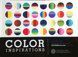
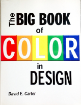
Choose the right color palette. Color never seizes to surprise me. Dark green normally won’t pop off the page as a highlight color. Paired with bright colors, however, it’s the first thing your eye goes to on a page. Two books I refer to all the time, are Darius A. Monsef’s Color Inspirations and David E. Carter’s The Big Book of Color in Design. The first is an indepth exploration of color palettes organized by color. CMYK color values are provided for each of the thousands of color combinations. The second book showcases color by mood. This is a great way to understand what tonal values appeal to different target markets—classy, fresh, exciting, healthy, corporate, tasty, soothing, powerful, trustworthy, etc.
Brainstorm. After digesting all of the above, I do a word/phrase brainstorm session. I do a mind dump—a thesaurus really helps—of all of the things I’d like to communicate in the new logo design. Things tend to fall naturally in columns. My belief is that nothing is too outlandish at this stage. If an odd image pops into your head—a moon crumbling like blue cheese—write it down. It may not be the idea you choose, but it might lead to the one you will.
Design inspiration. Once you’ve got a robust list of words and phrases, plug them into a stock image site to see what visuals come up. The broader the term, the more fruitful the images will be. You may realize an established icon will capture the concept you’re after if you change the illustration style—a textured brush stroke or a bold color combination. Many times pairing two things from different columns of your brainstorm list can generate unusual and engaging results.
Select the best ideas. I love the brainstorm process and usually generate multiple pages of ideas ranging from ho hum to wacky. Many times I’ve found that my initial ideas were things I’d seen somewhere before. So, push yourself. Start by actualizing your best ideas.
Edit and edit some more. The art of developing a great, memorable logo, is to tweak, tweak, tweak. Try different illustration styles, colors, shapes, fonts. When you get the right combination, you’ll know. One book I refer to all the time is Jim Krause’s type idea index. Organized by general mood, it shows how different typefaces can be combined or used singly to express a concept.
Present logos professionally. I have a template for sharing logo designs with my clients that includes color and black and white versions of each design at an enlarged size and a small size. Often, this exercise alone will prompt me to further tweak a logo so that it presents well at any size. I imagine myself sharing the logo with the client in person and record those thoughts in written notes at the bottom of the page. This allows my client to share a PDF with the designs and my thoughts with trusted colleagues and friends.
Incorporate feedback. Remain open and welcome to all feedback—however critical. Many times clients like multiple logos. Understand what it is they like about each before you lose the essence of the original idea by marrying of two ideas that won’t work together. Other times, client input can help put a finishing touch that truly expresses them.
Pricing. Full Deck Design offers pricing based on company / organization size. More established businesses or organizations will anticipate new or updated logo plans in advance. Many times we’re asked to estimate costs during year-end financial planning to make sure the money is available. We recognize that small businesses can’t afford to spend as much as established businesses. For them, our goal is to design a killer logo at a lower rate that leads to other design opportunities and a profitable relationship over the long term.


