Best Brochure Design Practices
What truth will draw your clients, buyers, volunteers or donors? Before you begin, you need to understand who you’re talking to, what they want, how to give it to them—and if you can make them smile or laugh, that’s a bonus.

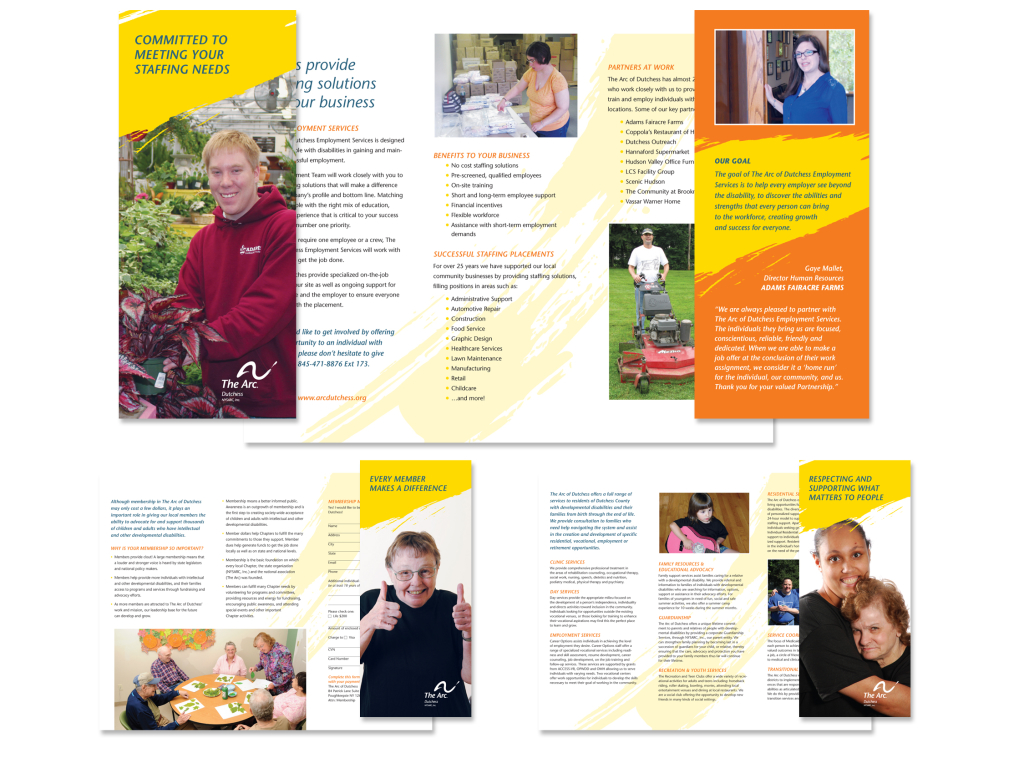
The Arc of Dutchess developed a suite of brochures in order to target three distinct audiences: potential clients, donors, and corporate participants in their work program.
Recipe for a Well-Designed Brochure
- Call-to-Action. Decide what you want readers to do and feature it prominently. Call for more information. Make a reservation. Get a free estimate. Join your email list. Attend an event. Become a member.
- Put Yourself in Your Their Shoes. People don’t want to hear about you. They want to hear what you can do for them. Make sure the text and visuals appeal to the reader. Avoid using internal acronyms and industry phrases.
- Branding. Always include your logo—and tagline if you have one. Adhere to the corporate colors inspired from your logo. Design should look like it belongs in the family of all of your print and online marketing materials.
- Power of Visuals. A catchy title and a strong cover visual are the best ways to entice people to open—or save—a brochure. Don’t clutter the cover with other text. Callout quotes or testimonials guide readers to key information. Graphs, charts or other visuals describe data more memorably than words. Give the design room to breathe by leaving “white space.”
- Compelling Text. Good writing inspires action. Between the text and the visuals, a brochure should tell a story that resonates with the reader. Less is more when it comes to text. Succinct, focused copy will yield the best results. Bulleted text is easily skimmed and processed.
- Analytics. If you dedicate a page on your website for each brochure or campaign (www.abccompany.com/servicesbrochure), you can evaluate the success of the brochure’s call-to-action message by checking the analytics for that web page.
- Stay in Touch. Make sure to include your web address, phone number and street address if appropriate. Add social media icons and account names. Share an email address. Suggest joining your email list.
- Distribution. Add a couple of wafer seals to close edges and mail a brochure without an envelope. Stock rack card boxes at tourism sites, highway stops, welcome centers, doctors’ offices, police stations, whatever locations your target audience frequents. Add a downloadable PDF file to your website. Offer the brochure as a reward for subscribing to your email list.

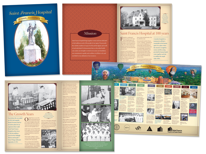
The 100-year anniversary inspired the antique-inspired theme and color scheme. Dozens of historical photographs made it a meaningful keepsake gift for hospital employees.
Common Brochure sizes and shapes
- Letter Trifold. Flat size: 11” W x 8-1/2” H. Folded size: 3.66” W x 8-1/2” H. Fits in a #10 envelope.
- Rack Card Trifold. Flat size: 12” W x 9” H. Folded size 4” W x 9” H. Keep titles in top 2” area visible in brochure rack slots.
- Single Fold. Various sizes are cost effective. Common size is letter sheet folded to 5-1/2” W x 8-1/2” H.
- Letter Full. Flat size: 17” W x 11” H. Folded size: 8-1/2” W x 11” H. Common format for annual reports, catalogs or other content-rich brochures.
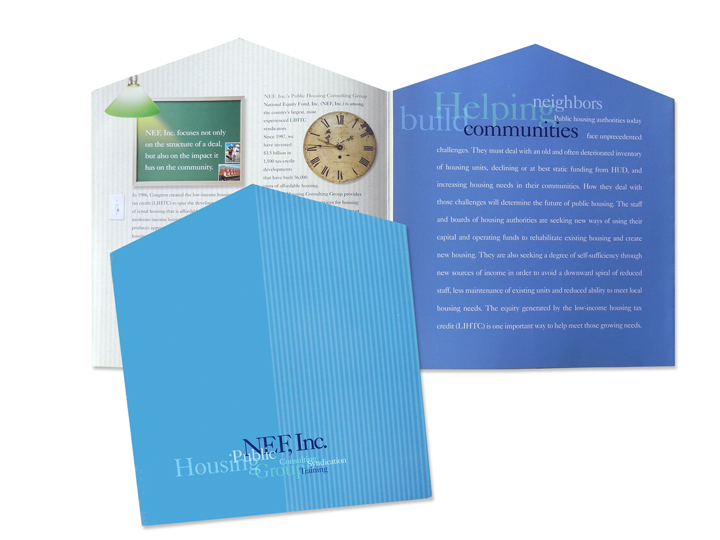
- Custom Die. A custom die enables printers to cut out a particular shape such as the house shape shown in the NEF brochure sample below. A custom die could also be used to cut out a peekaboo shape to show content through on inside page.
Hire a Professional team for the best Brochure results
- Graphic Design. Using professionally designed marketing materials gives a sense of credibility to potential customers, clients, sponsors, donors or members. It shows you’ve made a commitment to being around for the long haul. Though many try the do-it-yourself method of indulging the nascent skills of the summer intern, office manager, or someone’s nephew, hiring a professional designer will save money in the long run. One key sale. One new sponsor. One successful member drive. And, you’ve recouped the graphic design fee. Think of what could be gained over a brochure’s lifetime!
- Writing. A professional writer knows how to phrase a message that appeals to your target demographic groups. Consider involving a writer at the beginning, they can help develop ideas and story lines. They can also ensure that all marketing materials are written with a consistent voice or style. Typos and grammar mistakes reflect poorly on your business or organization—proofread everything.
- Photography. The high quality imagery a professional photographer can provide is invaluable and unique to your business or organization—especially if you’re selling products. If you can’t afford one, encourage a staff member to take a course on Lynda.com on how to use office camera and how to frame a dynamic image. If you don’t have original imagery, stock photography is plentiful and available at a range of prices and quality levels.
- Printing. For a fee, designers can get print estimates and supervise the printing process. Many times, designers will provide print specifications for you to get print estimates on your own for no additional charge. As a supporter of local business, I prefer working with local printers. They are typically more service-oriented, flexible about deadlines and concerned about the quality of the printed project. If you have a limited budget, there are many online print companies. If possible, pay the extra charge to prevent them from adding their logo or web address to your printed pieces. Higher quantities reduce the per unit price. So, you want to choose a quantity that will get you a good price, but don’t order so many that you’re sitting on them for years.
- Mailing. Due to increased postage fees and typically low return rates, fewer businesses and organizations are relying on direct mail solutions. If you’ve got an engaged member list, however, mailing can still be an effective way to communicate. If you’re offering a strong incentive, buying a targeted mailing list could yield results, but I’ve had many clients unsatisfied with the quality of the names on purchased lists.
- Online Distribution. Many organizations no longer print brochures or reports. Instead, they post a PDF file on their website. There are advantages to this solution. You save on printing and perhaps mailing charges. Images can be lower resolution—72 dpi for screen display quality vs 300 dpi for print quality. You’re helping the environment by using less paper. You can update the brochure content frequently and easily which can be especially beneficial if content includes sensitive pricing. There are also disadvantages. You don’t have materials on hand to distribute. People tend to browse online materials more superficially. A printed brochure can hang around on someone’s desk until they’re in need of your services. You have no control over the quality of hard copy printouts.

